Five great visualisations
A subscriber shared this recent FT piece on tennis that featured a very simple but insightful visualisation. I wanted to pass that along, with a few of my favourite added to the list.

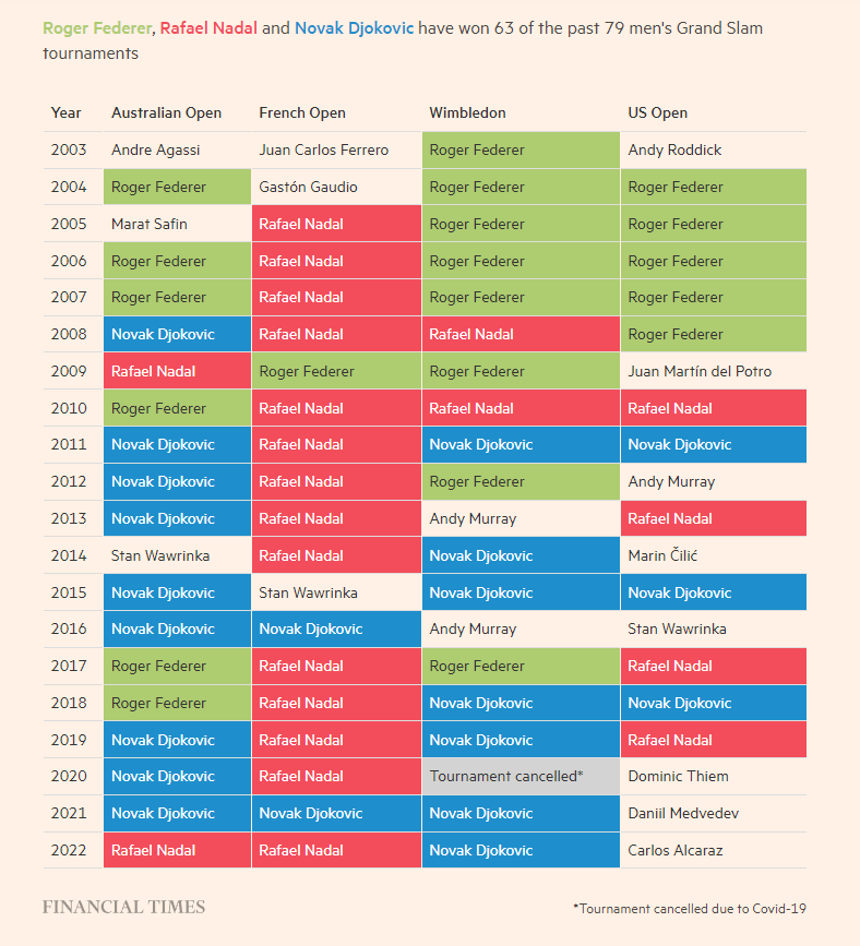
Tennis grandslam winners from the FT. Similar to the rainfall table from my post about time and rain. You can go a long way with a table and some shaded cells! This one immediately shows you just how much Roger Federer, Rafael Nadal and Novak Djokovic have dominated men’s Grand Slam tournaments. And also how much a clay court (as in the French Open) seems to favour Rafael Nadal.
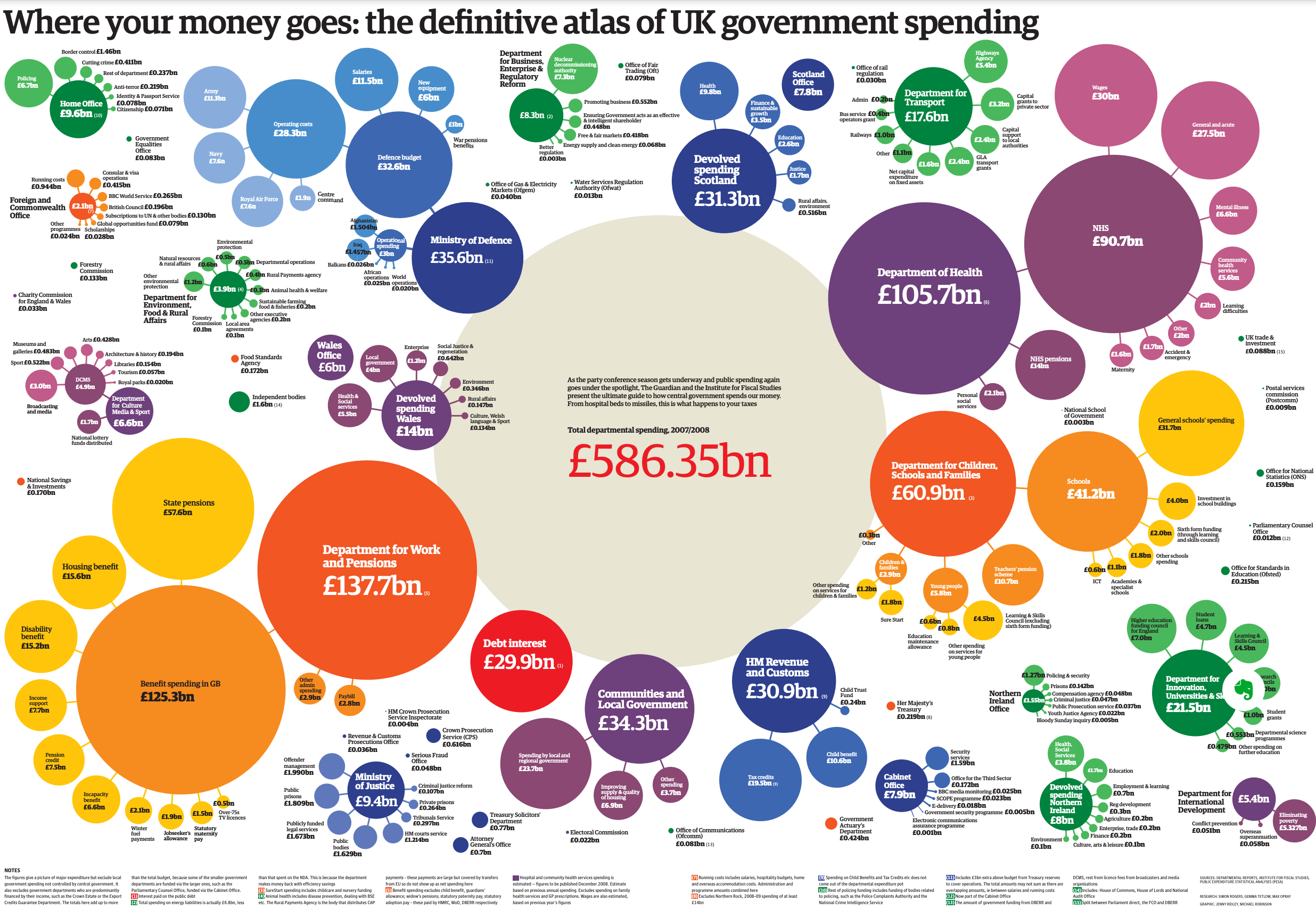
The Guardian’s guide to government spending. An oldie, but one of my favourites. From a time when data viz was as hot as AI is today. Lots of colours, circles and different formats. It intuitively gave meaning to numbers that are too big to process when you just see them in a table. There’s a full colour wall poster - and a few years of interactive versions. But alas no versions for current spending.

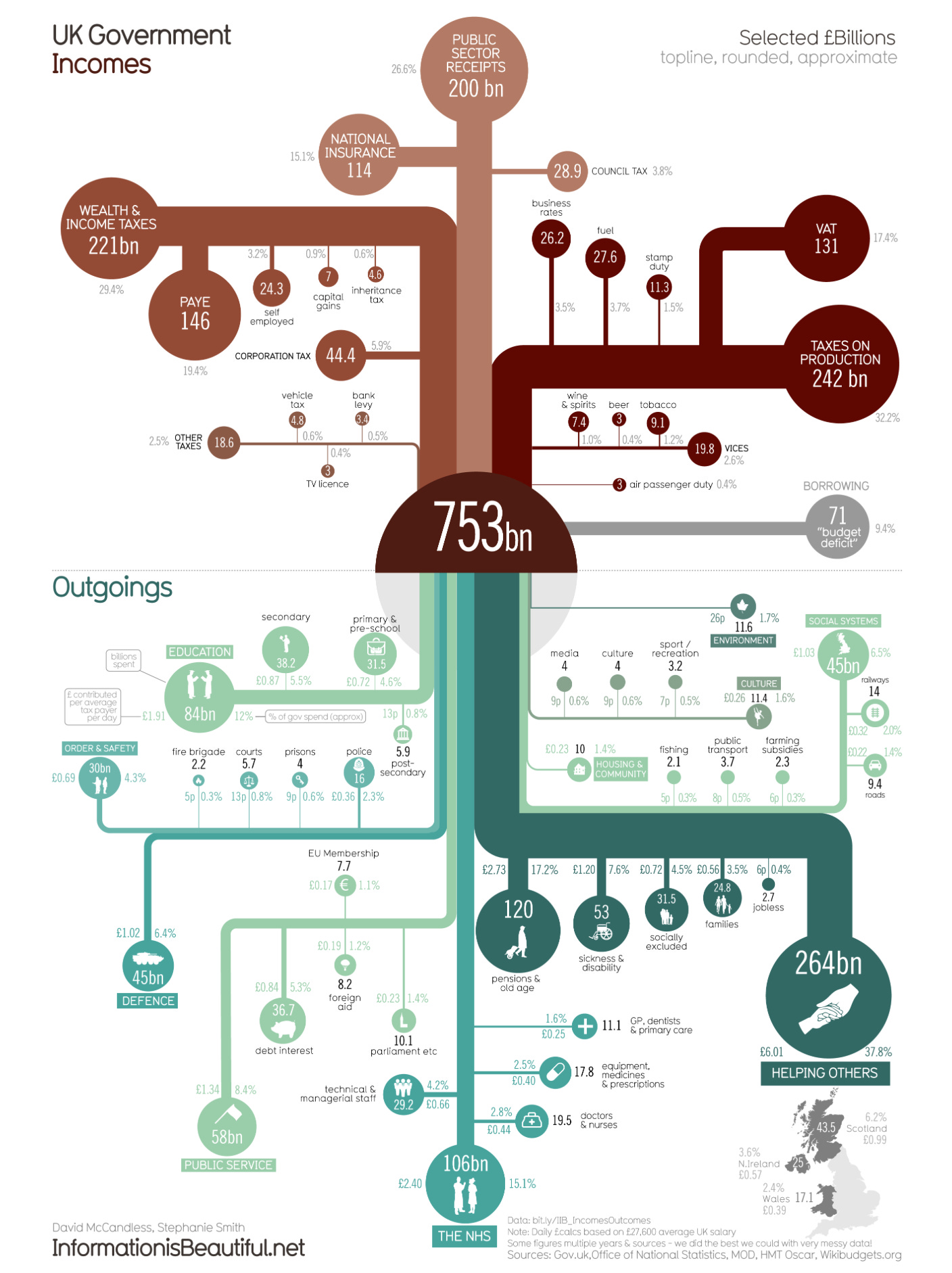
For an up to date visualisation of UK government spending. Information is beautiful’s income and outgoings graph gives the current picture for the UK. Although I do miss the Guardian’s circles!
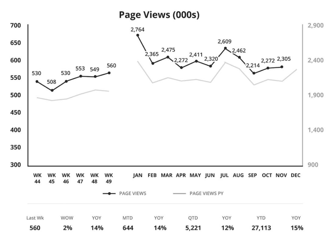
That’s enough of all those colours and complex shapes. What about visualising data for trading meetings? I’m a fan of this graph for showing multiple time periods at once. A visualisation from Amazon’s business review reporting. The graph comes from the book Working Backwards by Colin Bryar and Bill Carr. Visualising time series data, particularly for key business metrics like sales, visitors, sign-ups etc. is a surprisingly thorny problem. It’s hard to avoid relying on pages and pages of tables. Often popular with the CFO, but totally inscrutable for most of the rest of the management team. I feel like if your reports require a ruler to be read, something has gone wrong in the design phase. In this example, the lack of labels on either axis does make me twitch though.
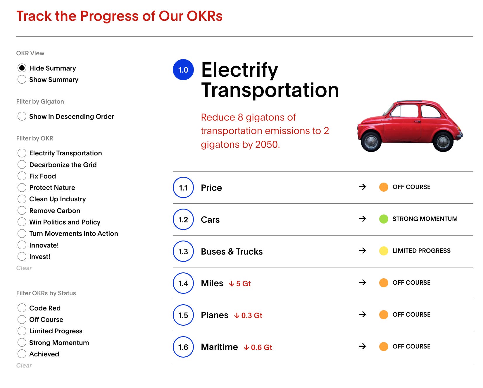
John Doerr’s Speed and Scale OKR tracker - Creative use of OKRs here, to express huge goals. Save the World! The tracker has a really clear and clean framework for showing the status of the individual key results. I must admit, my OKRs never looked this good!