
Is it really raining?
Playing with time is a powerful way to dig out insights in your data.

A friend of mine who’d recently moved to the UK, asked, “how does anyone do anything outside in the UK? It’s rained every day for the last week!” They looked totally unconvinced when I suggested they need to start thinking about hours when it rains, not days. Much like the productivity advice to only write off a couple of hours at a time if you’re feeling low, rather than the entire day. Don’t write off a perfectly good day for a couple of hours of rain.
Weather data from the met office is more convincing. Looking through the lens of days when it rained, London seems very wet. 174 days when it rained in 2021. If you ran weekly but wrote off rainy days, that’d mean cancelling a run due to rain every other week. Zoom into hours, though and it’s 951 hours it rained in 2021, about 10% of the time. You go from skipping a run every other week to skipping a run once every two and a half months.
Here’s the number of hours it rained every day in 2021. The deeper the blue the more hours of rain.
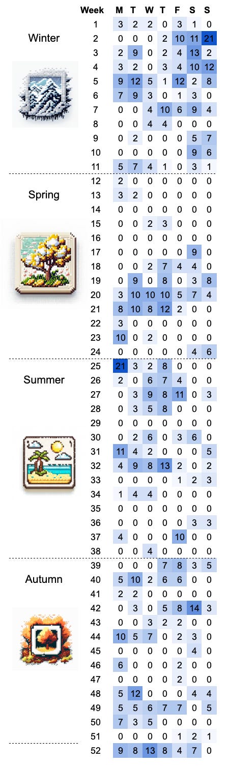
If you don’t think about rainy days, but look hour by hour, you’ll find lots of time to go for a run, walk or swim. Failing that there’s always the wisdom of Alfred Wainwright ‘There’s no such thing as bad weather, only unsuitable clothing’.
The conversation struck me as an example of two important concepts and pitfalls when trying to make decisions from data.
Zooming in and out, or adjusting granularity, can unearth new insights. As with rainfall.
And that time is often tricky to work with, a cause of many errors and misinterpretations.
To illustrate a pitfall. A new member of the security team raises an alarm over a spike in traffic. There’s been a 10x increase in traffic in the last 2 hours, much bigger than anything else on the graph! Are we under attack?
Time to zoom out, how long is the date axis on that graph? In this instance a rolling 3 days. There’s a monthly and weekly cadence to our marketing activities, how does it look over a full week or month, compared to last year?
Zooming out shows the spike is a normal part of the marketing rhythm and nothing to be worried about. Everyone can stand down.
So what are we to do?
When you’re looking at analysis or reporting you need to have four questions at the ready:
Time frame: What time period does the data cover?
Units: What granularity of time is being used? minutes, hours, days, months?
Context: Are the time period and units right for the question I’ve asked?
Sample size: Is there enough data to rely on the answer?
Any time I hear a number, my first thought is ‘When?’ Sales grew by 50%, between when and when? Days, weeks months? This is a radically different stat if it’s between 2021 and 2022 vs 11.00 this morning and 13:00 in the afternoon.
Sample size factors in here too, as you shorten the period your data covers you’re reducing the sample size. That means more volatility and more likely you’re going to take the wrong read from the data. I should caution. In my experience, most people asking questions of their data want to do so at a granularity that’s too volatile to deliver useful insights. This can lead to bad decisions and wasted time. Of course, there are lots of statistics we can use to try and work out if the movements in our data are just noise or meaningful. But you can get through most day-to-day challenges with a simple rule of thumb. If your sample is less than 50 for each data point, take extra care!
So why not get outside? There’s only a 10% chance it’s raining.
A few quirks of date and time that catch us out
In America the standard date format is month/day/year, in Europe, it is day/month/year. Is 12/01/2023 the 12th of January or the 1st of December?
24 hours in a day, 60 minutes in an hour, 60 seconds in a minute, 1000 milliseconds in a second.
Leap years have an extra day.
Time zones and seasons, need I say more?
Daylight saving time - the time is an hour different according to the season in some countries.